KAMI KUBI
Creating a brand for the woman who dresses real
Timeless. Real. Unfiltered.
Disha Lifestyle is a leading wholesaler of women's apparel based in Ahmedabad. From fabrics to readymade clothing, they have a legacy of over 30 years in the B2B space. Now they wanted to chart a new direction and venture into the B2C retail space with a new in-house brand.
With an initial focus on Indian ethnic wear, they aspire to eventually evolve into a global lifestyle brand. So the challenge was to create a brand that is modern and global in its approach yet possesses an Indian soul. On top of it, they wanted to be a pocket-friendly brand with a mission to make quality products accessible.
We conducted extensive immersions with the target audience, and we found out that dressing up is no longer about looking special but about feeling special. Also, everyone talks about quality products and it took more than just that to appeal to customers. People are more attracted to the brand story. While competitors in this space talk about the variation of products, the service, and getting the right fit, we wanted the brand to stand out and talk about its belief rather than the product.
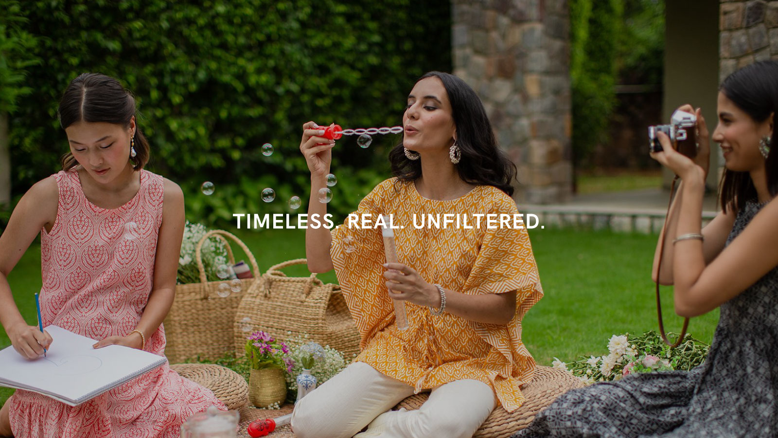
CELEBRATE YOUR KAMI KUBI,
CELEBRATE YOURSELF.
With an ode to the Japanese concept of Wabi Sabi; the philosophy of accepting your imperfections and making the most of life, Kami Kubi denotes that every real woman has both “Khubiya” and “Khamiya”, which makes her real. The brand celebrates both flaws and merits of our audience, embracing what makes them most real.
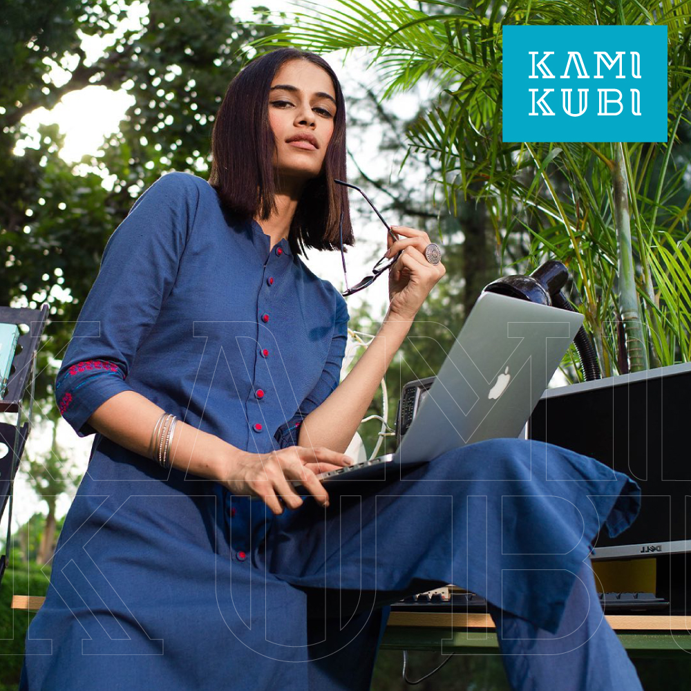

FOR THE REAL WOMAN
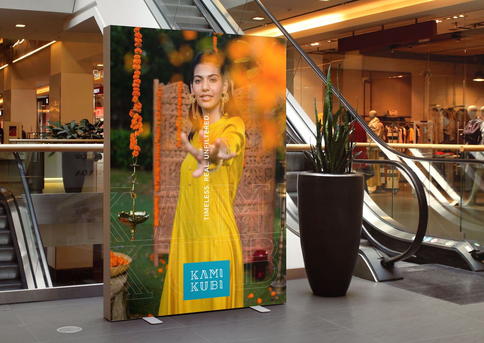
Real women are what they are - real. Irrespective of the generation, irrespective of the surrounding - a woman will always be the best image of herself. We positioned Kami Kubi as a brand that speaks to these women, provides them with a platform to be their true selves, and allows them to develop their own style. A brand that is timeless, real, and unfiltered.
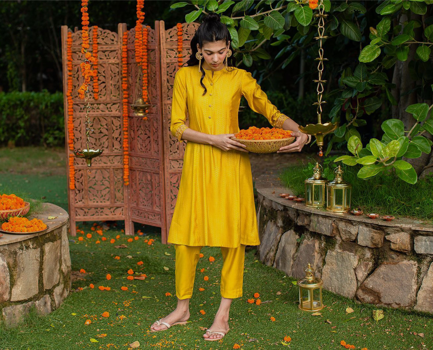
BRAND NARRATIVE
Because we believe that the industry defines fashion and its wearer on certain parameters, we aim to change expectations by providing timeless products that are classically designed for the woman who dresses real.
TIMELESS. REAL. UNFILTERED.
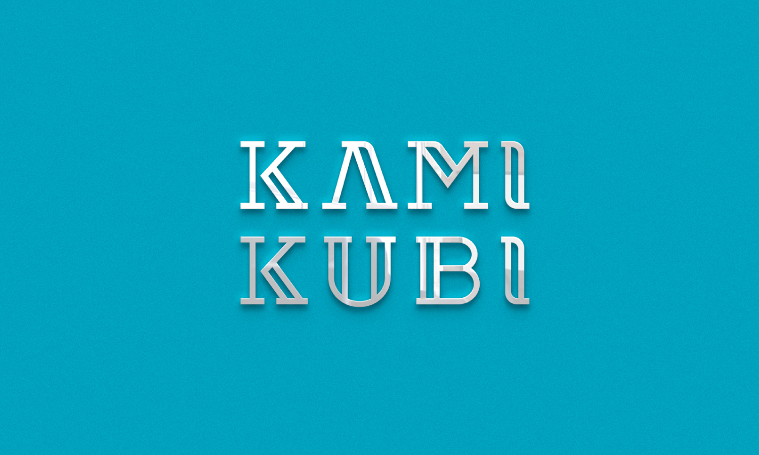
VISUAL NARRATIVE
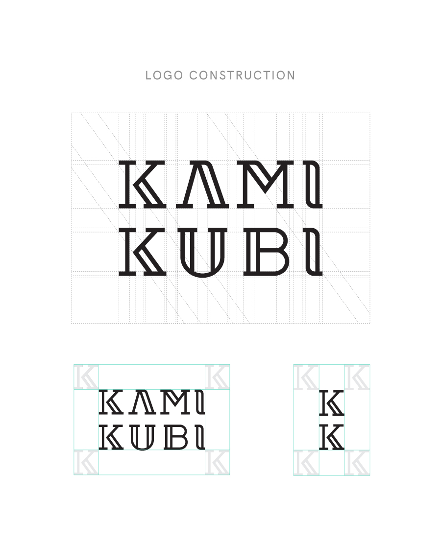
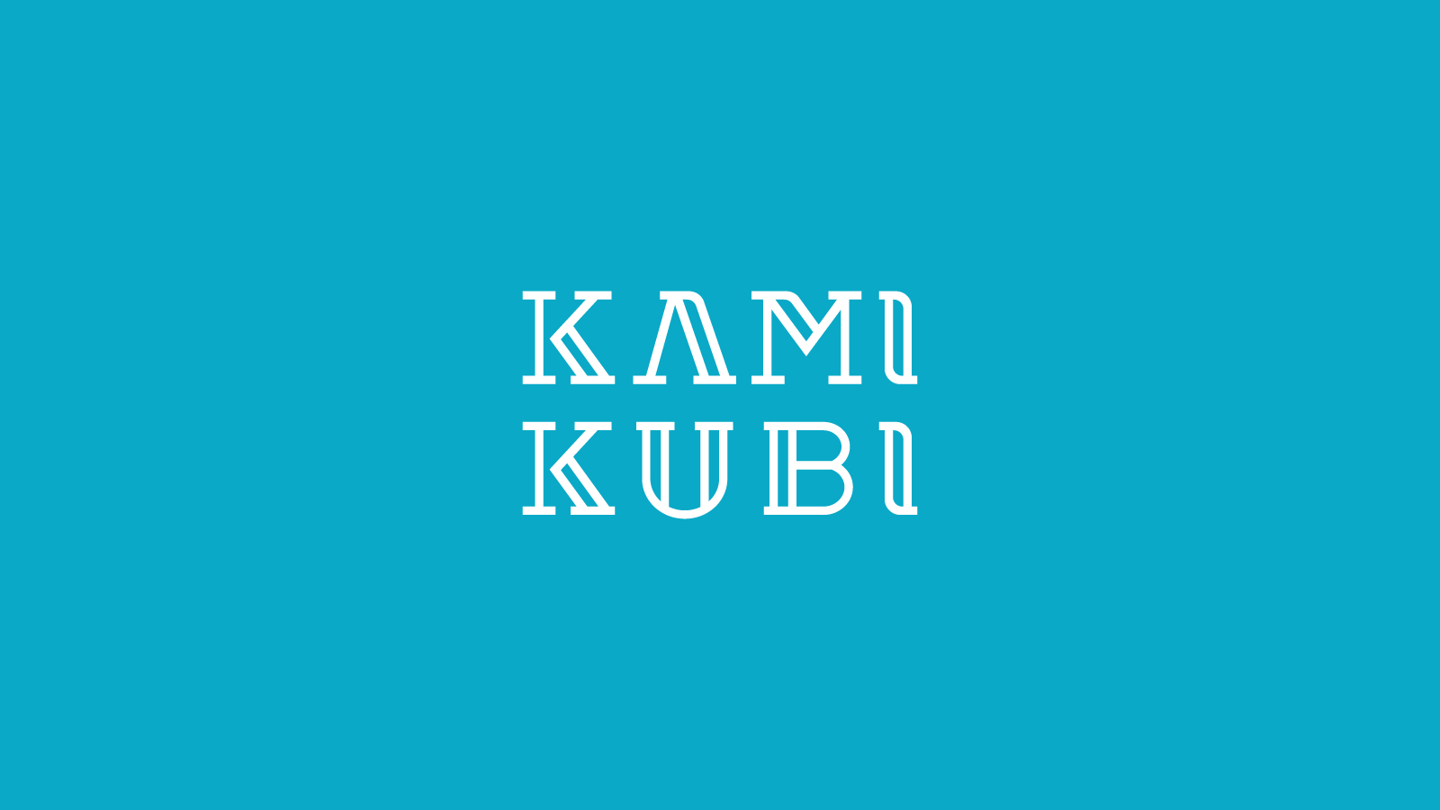
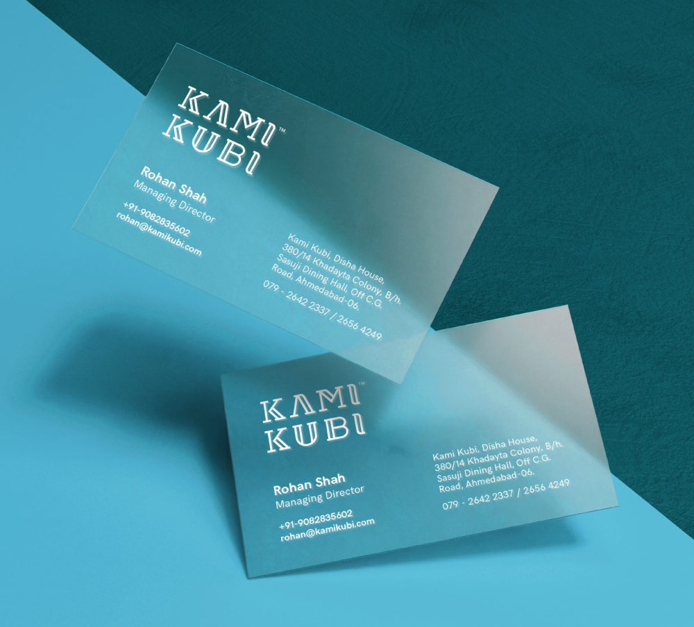
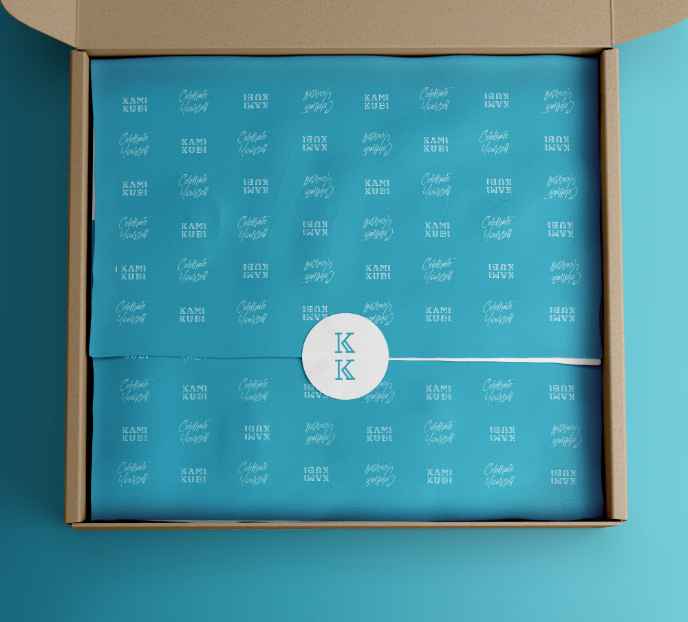
The goal was to create a visual identity that is unique, classic, and real, but also premium, to help the consumers feel like part of a special community. We needed something that can remain timeless across years. After a lot of explorations for the logo, we decided to go with a custom hollow serif logotype that I designed. It’s classic yet modern. The hollow stripes, consistent strokes and geometric structure gives it a premium feel that can appeal to consumers all over the world.
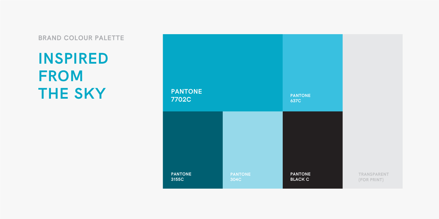
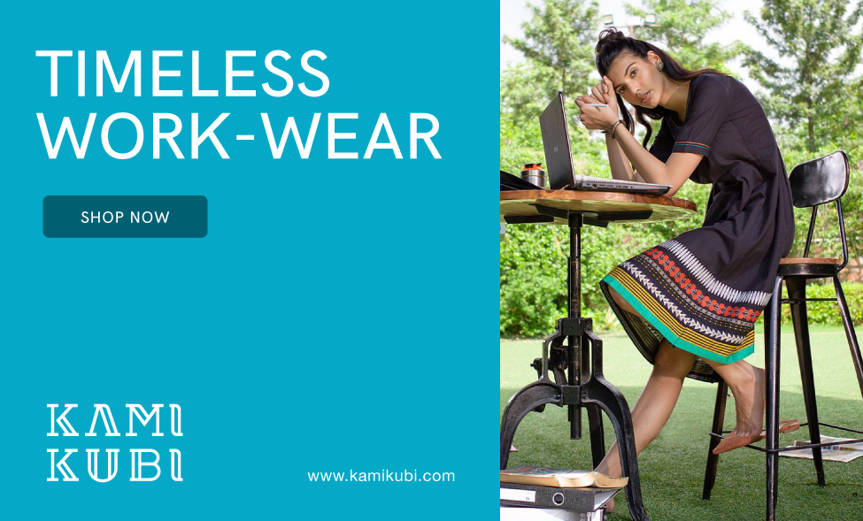
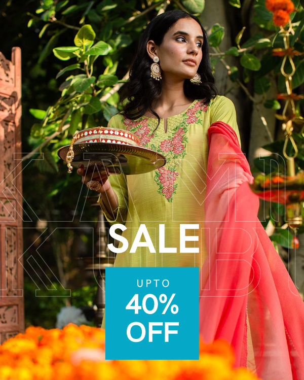
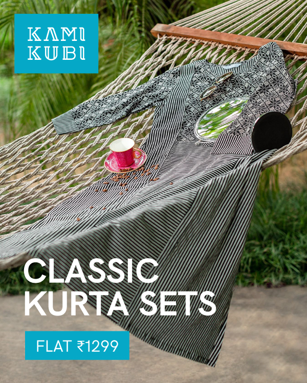
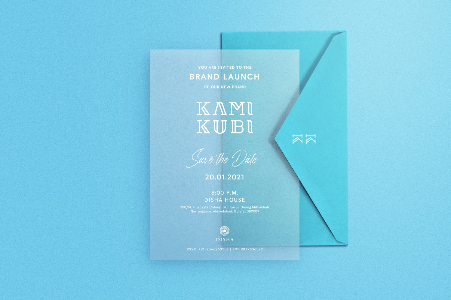
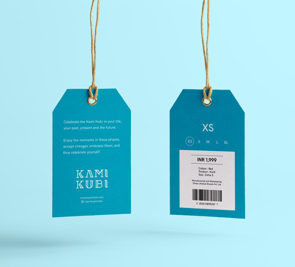
It’s further translated into a simple and bold visual style. The identity’s understated elegance extends to applications, which employ a clean aesthetic and subtle use of color. The color palette is inspired by the sky. The sky symbolizes realness and positivity which mirrors the brand concept. We also decided to keep our print collaterals transparent to depict transparency in everything that the brand does.
