SUPAFLY SALON
Visual Identity for a high-end quirky salon
Be your own kind of beautiful.
The Challenge
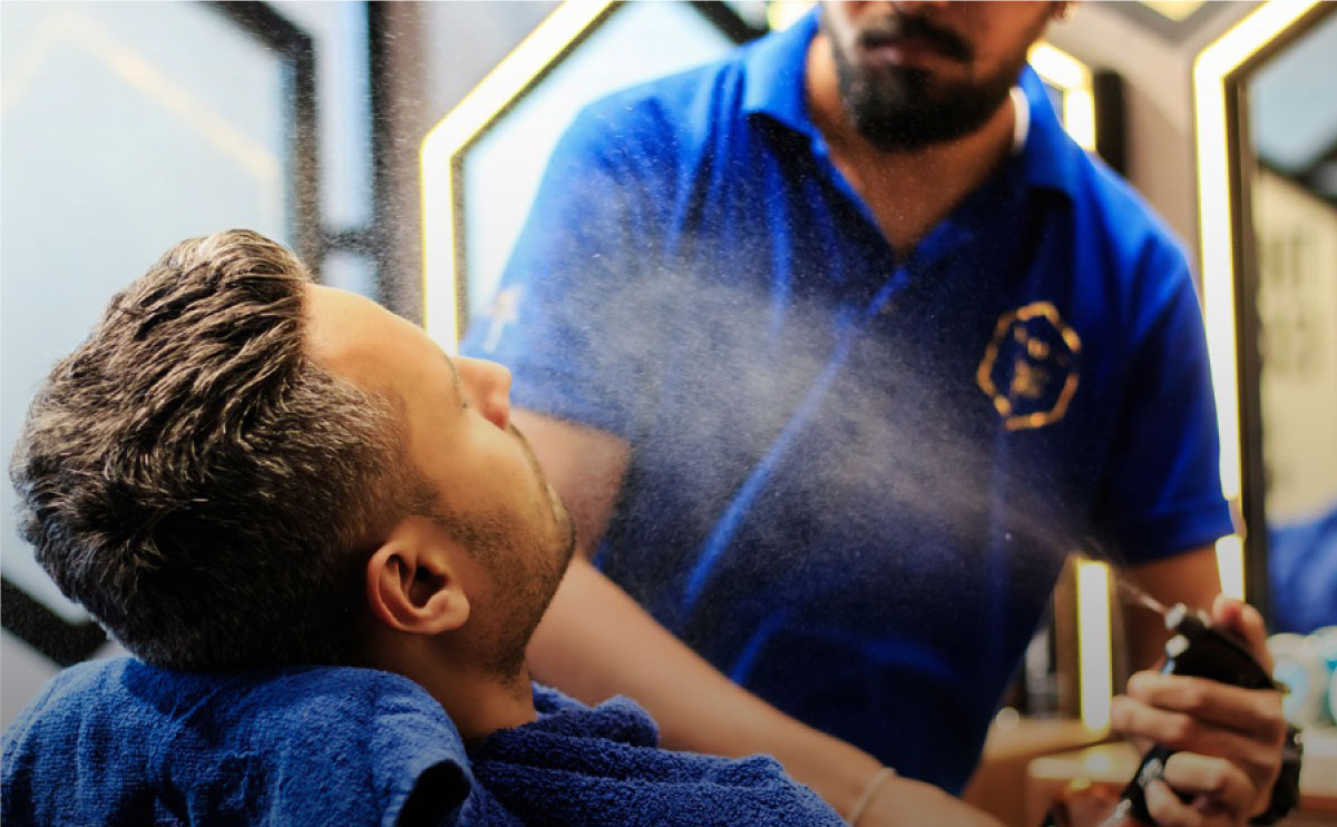
Supafly wanted to create a niche space for itself in India’s cluttered market of hair and body care. Hence, I positioned it as a brand that took premium services to a whole new level. We targeted Surat’s plush yet on-with-the-trend crowd that was willing to pay the price to get the best quality in the market.
Approach
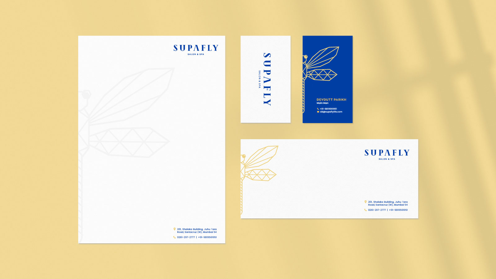
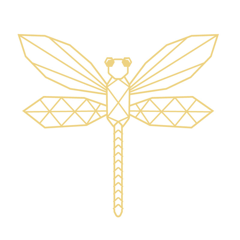
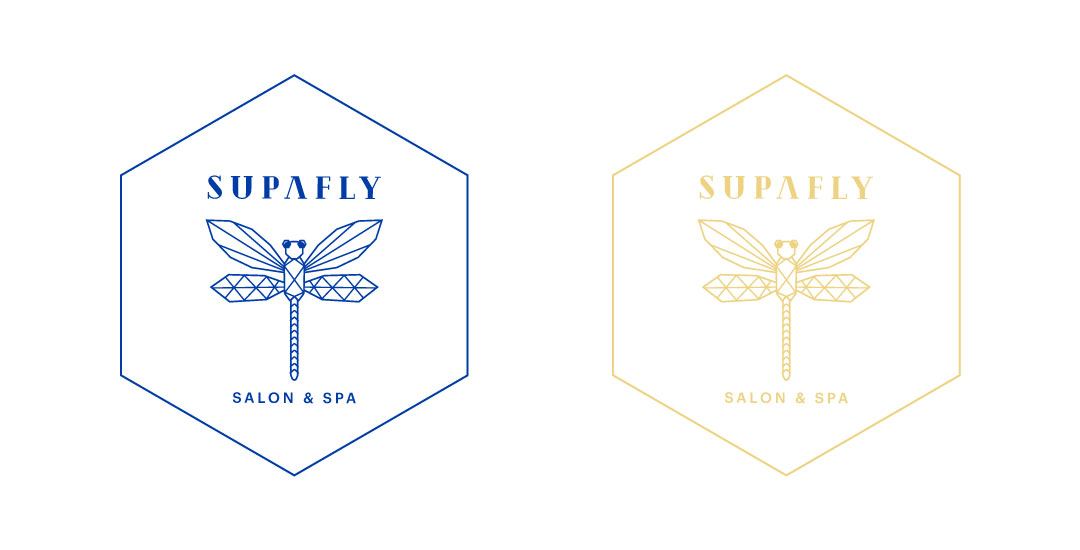
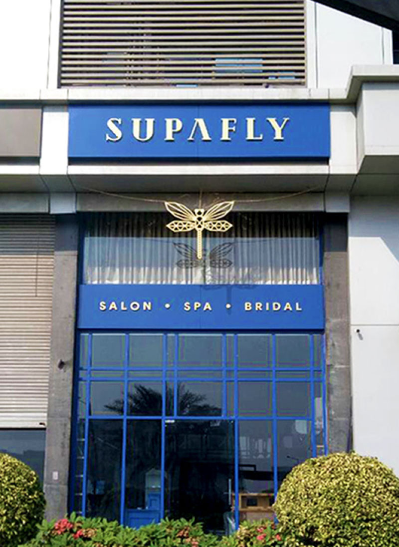
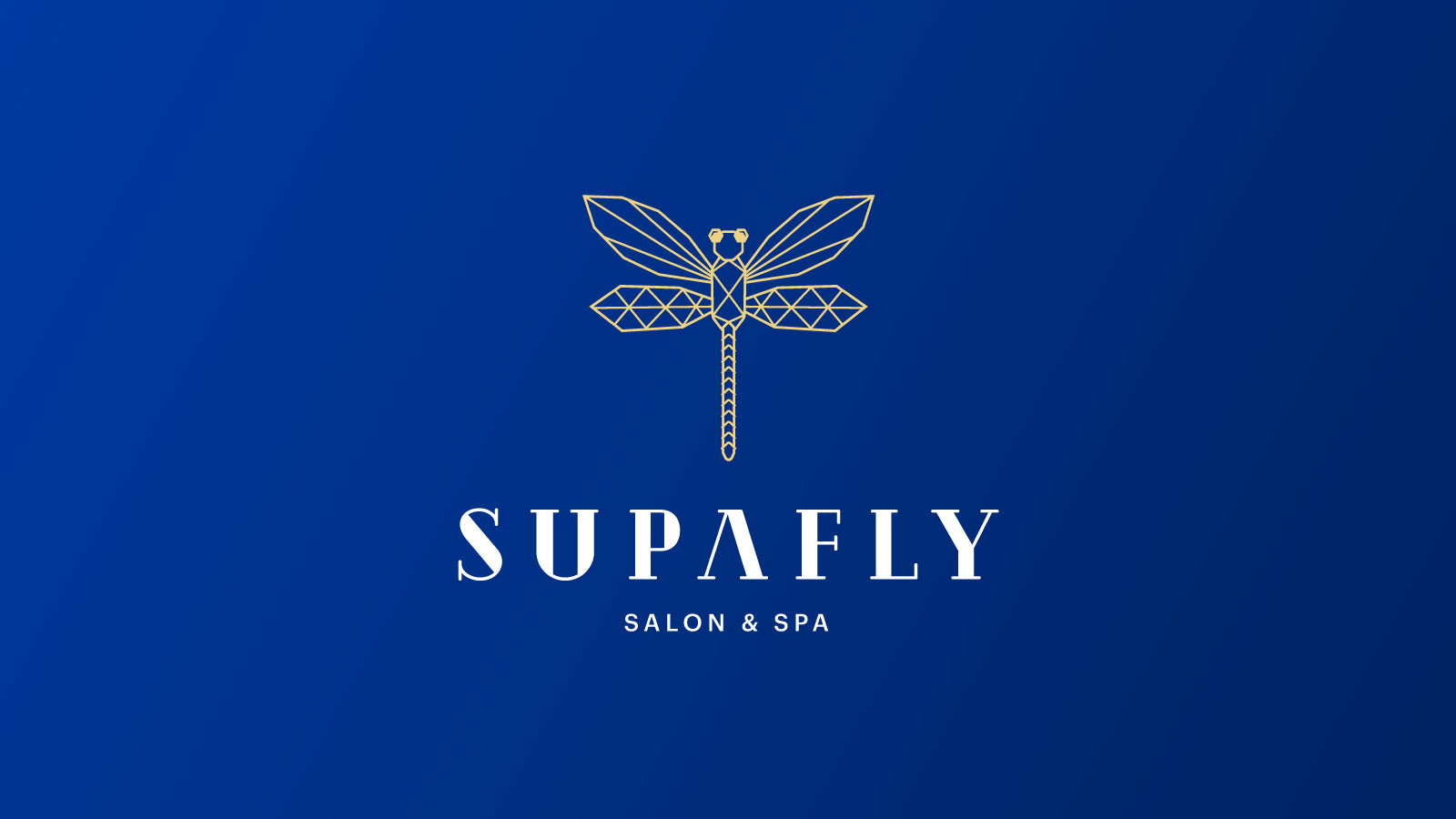
It’s unique and quirky, It’s premium and extraordinary. Folks at Supafly were willing to walk the talk, so I decided to take the route which showed Supafly as a quirky brand that spoke to the first-hand trendsetters in the city and gave an ultra-luxurious experience to all its customers. After a lot of brainstorming, I decided to make ‘Dragonfly’ the brand mascot as it completely exemplified what Supafly stood for, transformation and change for the better. This was the last piece that made Supafly an exquisite salon in the heart of Surat.
Outcome
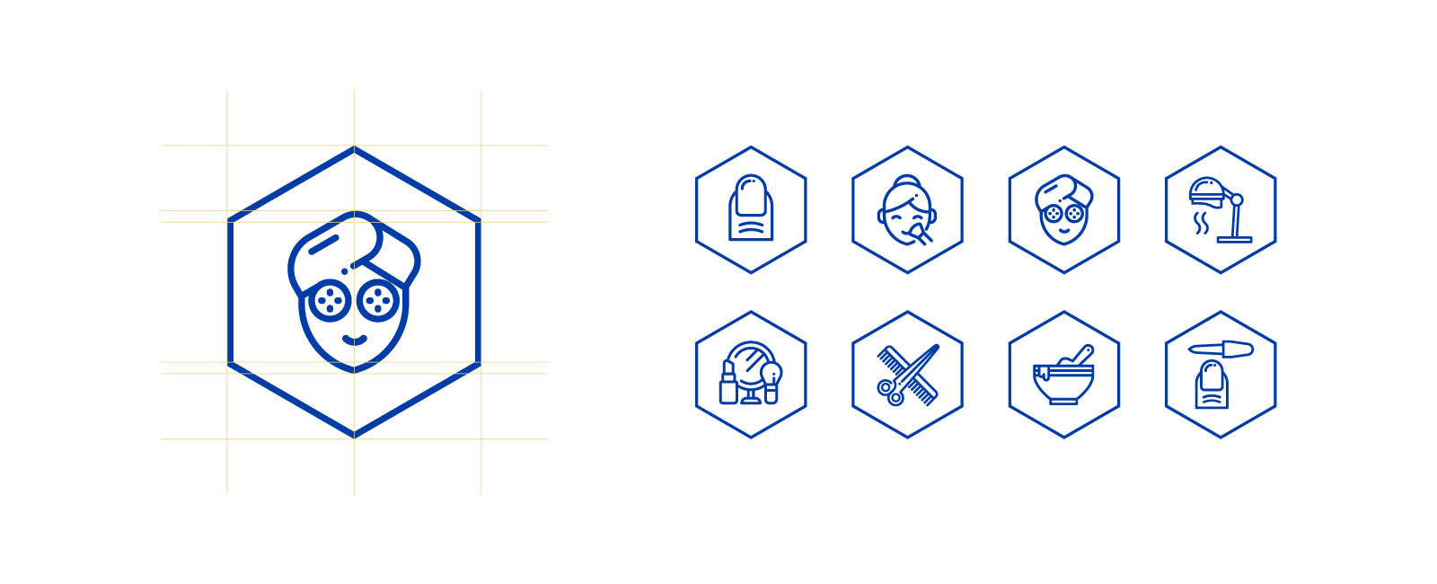
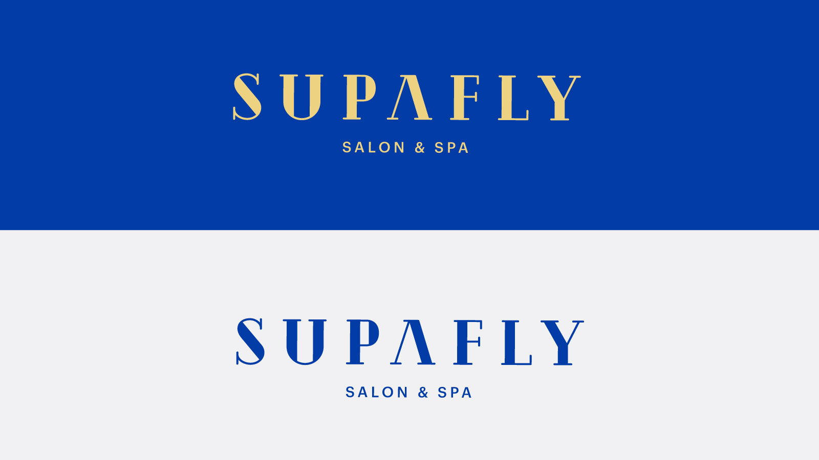
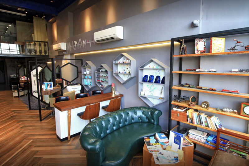
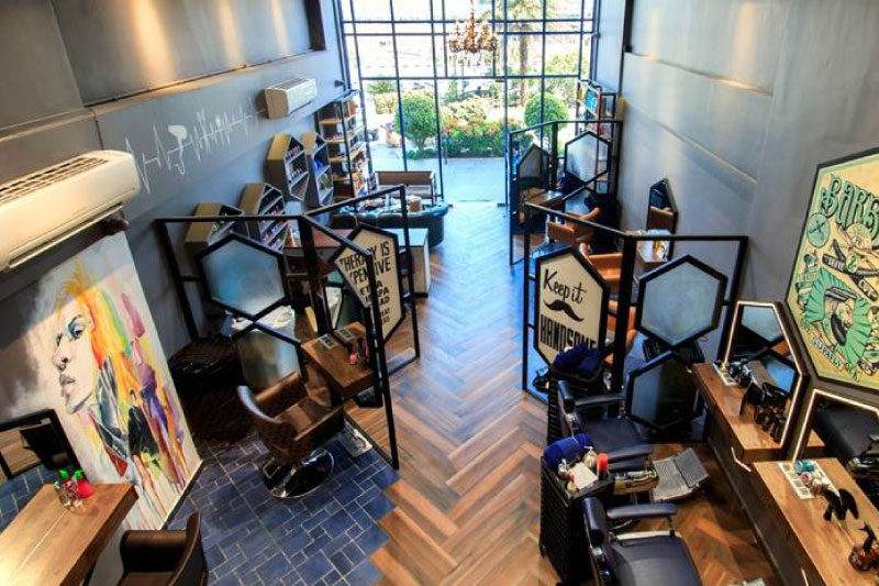
The geometric sharp lines in the bordered dragonfly logo represent confidence, sturdiness and discipline. The exact qualities that define the vision of Supafly. These brand-defining geometrical structures were extended to the interior of the outlet and every other point-of-contact of the brand. The hexagonal structure humanizes the brand whereas the sharp lines act as the skeleton.The serif typeface font gives the chirpiness to the brand where blue and gold, the primary colors outline the image with luxury and grandeur.